Podd
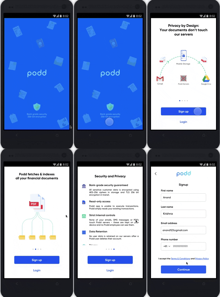
I redesigned the Signup screens to enhance visual aesthetics of an otherwise text heavy app which increased their user sign up by 17%.
Themes
Heuristic Evaluation, UX Research, UX Design, Stakeholder Presentation
Team
Product Owner, 2 Developers, Sr UX Designer and Myself (UX Designer)
Tools
Figma, Google Doc/Slides, Miro
Timeline
4 Week, Design Sprint
Project Overview
An android app that lets you access and manages your Gmail files, all in one place.
Podd is an Indian startup based in Bangalore. The purpose of this android app is to make users go paper-free by accessing all their Gmail documents, categorizing them, and removing the passwords of documents (if any) so that users can access them whenever they want without compromising the security of their documents. This concept is somewhat new in the region (India) they want to launch the app. Podd brought me on board to help improve the existing design they have. They want me to give my design reviews and recommendations of their existing Figma designs.
Goal
How might we increase the number of users for the sign up?
Solution
I prepared a detailed report containing a prioritized list of positive and negative issues using Jakob Nielsen’s Heuristics.
As UX designers, we encounter design problems every day. Recognizing how best to tackle these issues means investigating, analyzing, testing, and prototyping solutions until we have the answer that fits our user’s needs.
Planning
My first priority was to divide the work into the timeline given, so it will be easier for me to deliver the work. That’s why I planned my work and divided it into 4 tasks.
Define the project scope.
Know the business requirements and demographics of the end-users.
Decide on which reporting tools and heuristics to use.
Evaluate the experience and identify usability issues.
Analyze, aggregate, and present the results.
1. Project Scope
Due to the limited time, I focused on the Splash screen, Sign up/Login screens, Home page, and Podd Travel feature.
2. Business requirements and demographics of the end-users.
Business requirements
Podd fetches all the merchants sent attachments like travel receipt, bank statements, hotel, and taxi receipts, insurance policies, etc. to Gmail, streams, and categorizes them via the user’s device to a folder on their Google drive. Giving them an easy way to see and track their documents anytime in their mobile via the Podd app with bank-level security and for free.
End users demographics
Tech-savvy Millennials.
3. Decide on which reporting tools and heuristics to use
The reporting tools I used were Google slides and Whatsapp.
The Heuristic evaluation (HE) is a favorite for UX designers to use when they need a quick, low-overhead way of highlighting issues in interaction design. For this report, there were 2 heuristics to choose from
1.The Weinschenk & Barker Classification and
2. The Jakob Nielsen’s 10 general principles.
Jakob Nielsen’s heuristics are probably the most-used usability heuristics for user interface design. Nielsen developed the heuristics based on work together with Rolf Molich in 1990. The final set of heuristics that are still used today were released by Nielsen in 1994. Also known as ”Usability Heuristics’,
Of these 2, I decided to use Jakob Nielsen’s principles which seemed the most appropriate for analyzing the tasks.
4. Evaluate the experience and identify usability issues
Design is an investment of time, effort, and ideas. But it becomes an expense when users don’t perform the way a designer thought they would do. That’s why it’s not enough to design a nice-looking product; it also has to be usable, and the largest ROI from any product is its usability—which generally refers to the ease of use—takes on a crucial priority.
A well-designed product has excellent usability, and because usability is a significant contributor to product quality, it boosts the user experience.
Heuristics Review and Analysis
I was hired by Podd to give my design comments and give some ideas for redesigning their existing app to make Splash screens and Home screens more user friendly.
To use Jakob Nielsen’s 10 general principles for interaction design, I put myself in the shoes of users by downloading the app on my mobile and signed up as a new user.
Findings
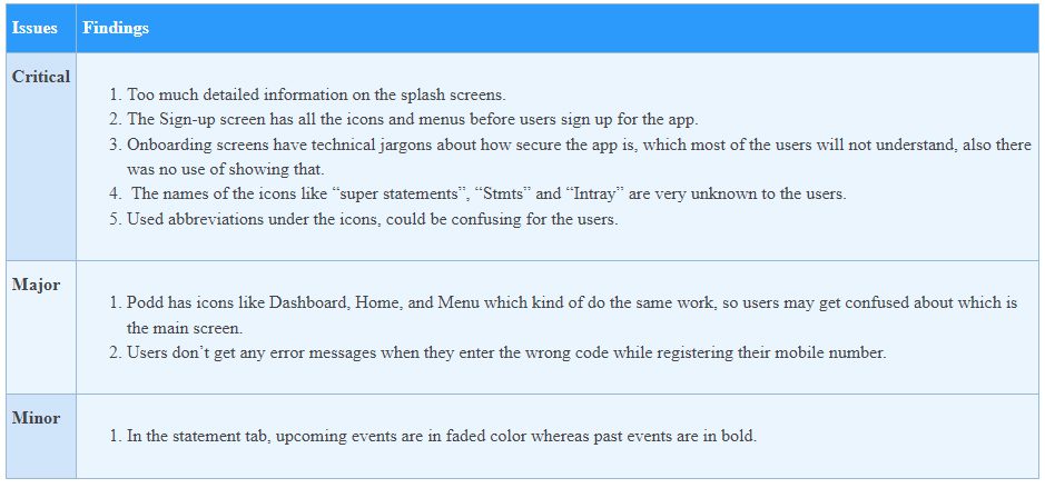
Some of the major and minor issues I found are in the table below:

Negative Findings
Critical Issues
Aesthetic and minimalist design
(Dialogues should not contain information which is irrelevant or rarely needed. Every extra unit of information in a dialogue competes with the relevant units of information and diminishes their relative visibility.)


a)
Task:
Flip through the splash screens and register for the app.
Issues:
Splash screens contain lots of unnecessary and technical information which are irrelevant to the users.
Recommendation:
Remove the technical jargon and unnecessary backend diagrams from the splash screens will begin the user’s journey smoothly.

b)
Task:
Try to Sign up for the app.
Issues:
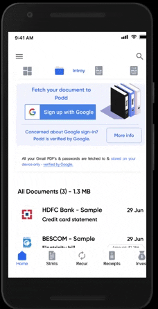
The Sign-up screen has all the icons and menus before users sign up for the app so it’s confusing, users already signed up.
Recommendation:
By removing the icons from the Sign-up will remove the confusion from the user’s mind and make the sign-up journey easy for the users.
2)Match between the system and the real world
(The system should speak the users’ language, with words, phrases, and concepts familiar to the user, rather than system-oriented terms. Follow real-world conventions, making information appear in a natural and logical order.)
and
3)Consistency and Standards
(Users should not have to wonder whether different words, situations, or actions mean the same thing.)

Task:
Check the bank statements in the app.
Issue:
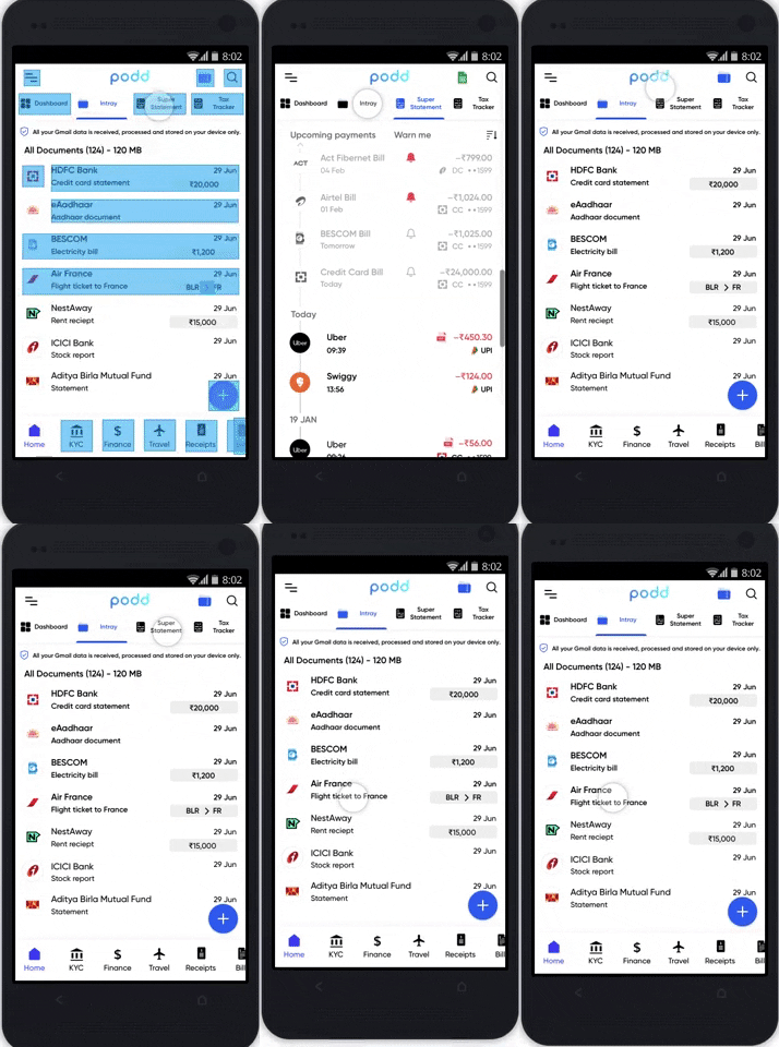
It has an Intray icon, a Super Statement, and a Finance icon but what is Super Statement and Intray? Where to see the bank statements?
Recommendation:
Keep the only 1option for all the bank related statements like Statements instead of the abbreviations.
4) Help users recognize, diagnose, and recover from errors
(Error messages should be expressed in plain language (no codes), precisely indicate the problem, and constructively suggest a solution.)
Task:
Register for the app using a mobile number.
Issue:
If wrong input users don’t get any error message or warning.
Recommendation:
Send an error message or show a warning sign with a message, if they enter the wrong code.
Major Issues
5) Error Prevention
(Even better than good error messages is a careful design which prevents a problem from occurring in the first place. Either eliminate error-prone conditions or check for them and present users with a confirmation option before they commit to the action.)
Task:
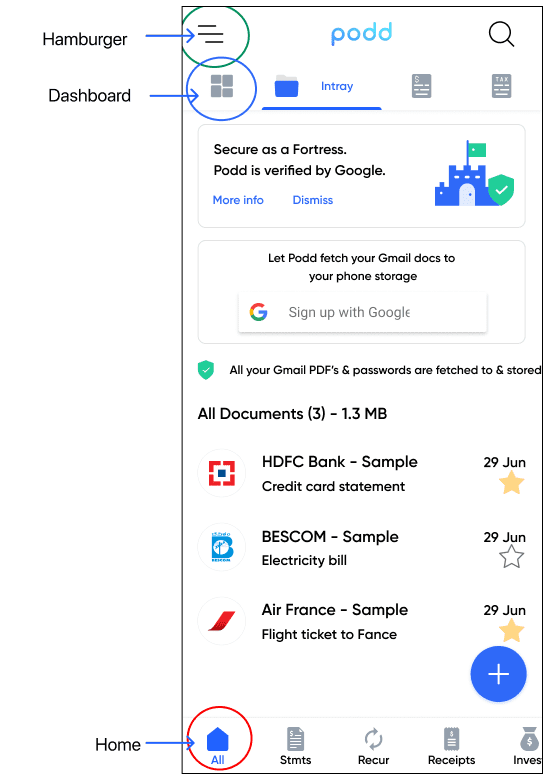
Re Login to the app and check the dashboard.
Issue:
Podd has icons like Dashboard, Home, and Menu which kind of do the same work, so users may get confused about which is the main screen.
Recommendation:
Keep one icon as a Home screen.

Minor Issues
6) Consistency and Standards
(Users should not have to wonder whether different words, situations, or actions mean the same thing.)

Task:
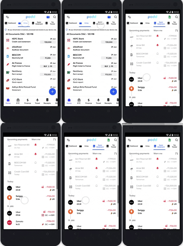
Check the upcoming payments.
Issue:
In the statement tab, upcoming events are in faded color whereas past events are in bold. But usually, users are used to seeing the other way round.
Recommendation:
Reversing the color will resolve the issue.
Positive Findings
During the evaluation process of the Podd app, there were many positive findings discovered using Heuristics Analysis. A few of the positive findings that were discovered have been listed below:
Visibility of system status
Every screen is clearly labeled and shows which page you are on with headlines and descriptions on the header.User control and freedom
I can go back and forth between the screens.Consistency and Standard
It is consistent with the entire app screens.
5. Analyze, aggregate, and present the results.
Detailed report
Review
This is the first time I am using heuristic evaluation for user testing. Previously, I have done usability testing in order to complete the testing phase of the UX wheel.
What I learned while performing this analysis is that a mature UX designer can solve approx. 80% of the design issues. Until this project, I used to think that the only way to do proper usability testing was involving the user for usability testing. However, I still feel the same but heuristic analysis may come in handy when you need a quick solution.
What have I learned?
From the project:
Heuristic analysis is an extremely valuable and helpful tool which should be used from the beginning of the designing phase of any project, it saves time, money and eliminates stress.
From the client:
1) It’s really important to set the agenda of the project at the first client meeting and make the goals/ roles clear and documented.
Communication via text or WhatsApp gets a timely and faster response than old fashioned emails. Because the client was extremely busy and they wanted to make a small modification in the communication method.
2) I could have asked this at the beginning of the project so that I could have saved my lots of time and stress.
Thanks for reading.
